But behind the laughs is a powerful design truth: tiny details change everything. If spacing can completely transform the meaning of a sentence, it can absolutely transform the feeling of your porch.
Today, we’re borrowing inspiration from those viral design fails—not to mock, but to master the art of intentional space. Let’s turn the lesson of “bad spacing” into bold, beautiful porch design that feels deliberate, calming, and irresistibly shareable.
The Negative Space Nook: Let Your Porch Breathe
Those viral kerning fails prove it: when everything’s crammed together, the message becomes chaotic. Porches are no different. Overstuff them with furniture, plants, and decor, and what should feel like a sanctuary starts to feel like a storage unit.
Instead, design your own “negative space nook.” Choose one part of your porch—maybe a corner by the railing or a stretch near the front door—and intentionally leave room around your main piece. A single sculptural chair, a streamlined bench, or a hanging chair can become a focal point when it isn’t competing with clutter. Add one plant with dramatic height or shape instead of six small pots. Use a slim side table instead of a bulky coffee table. The empty floor space, blank wall, and clear sight lines become part of the design, just like the gap between letters in a beautifully spaced word. Your porch starts to whisper instead of shout, and that calm is magnetic.
The “Headline Moment”: A Bold Porch Statement That Says Just Enough
Those poorly spaced headlines are going viral because your eye can’t look away—they're loud, confusing, and unforgettable. For your porch, you want the memorable part, not the chaotic part. Create a “headline moment”: one bold, clearly defined feature that anchors everything else.
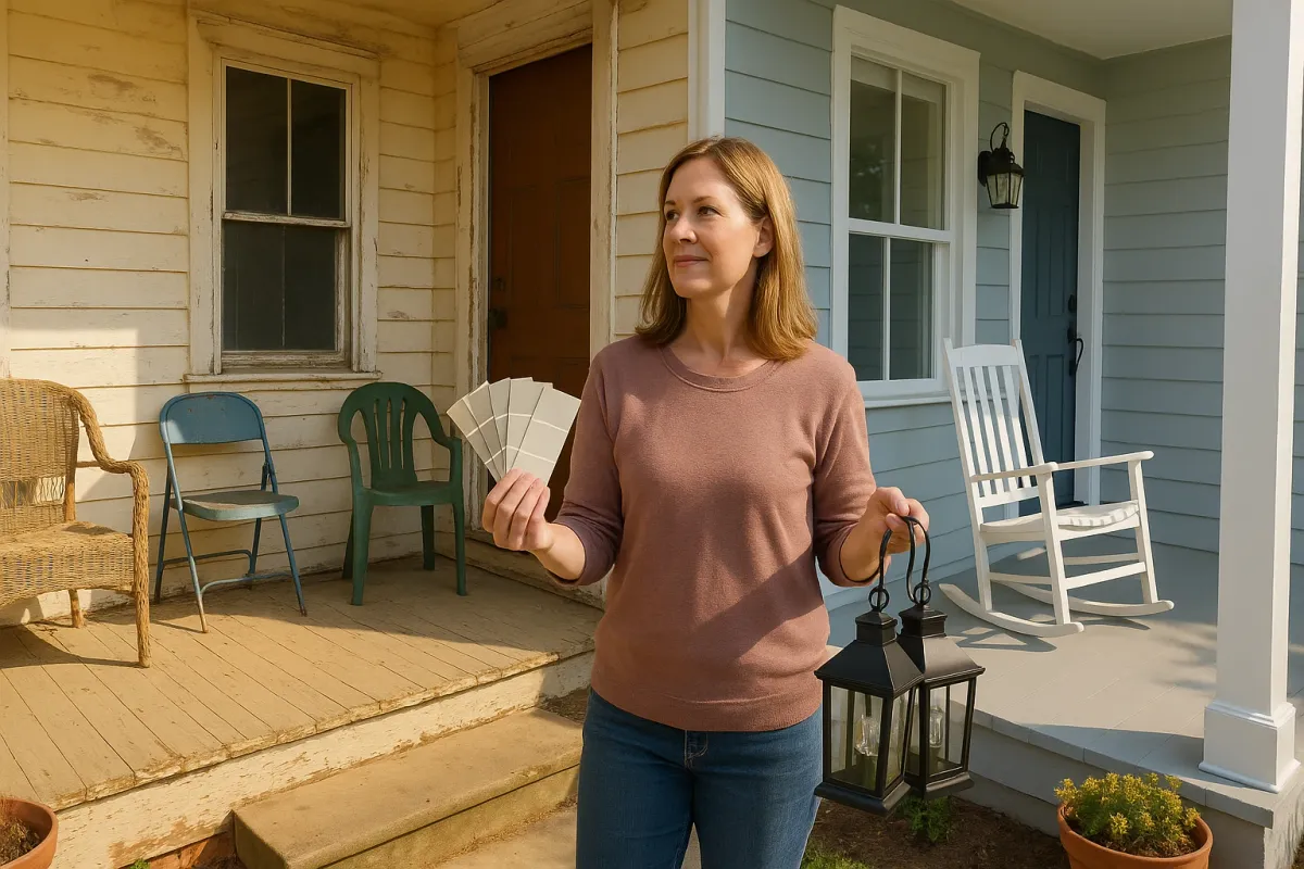
Maybe it’s a modern house number plaque glowing softly beside the door. Maybe it’s a single oversized lantern, an artful metal wall piece, or a striking outdoor rug with a strong graphic pattern. The key is clarity—just as a headline designer carefully chooses letter size and spacing, you’ll choose scale and position. Keep the area around your hero piece visually clean so it can shine. One big wreath instead of five little doodads. One statement planter instead of a cluster of random pots. This makes your porch instantly photographable and shareable—like the good kind of viral graphic.
Soft Borders, Strong Stories: Layered Edges Inspired by Perfect Kerning
In great typography, kerning isn’t just about distance; it’s about relationship—how one letter gently leans into the next. On your porch, borders and boundaries can work the same way, softening transitions between house, porch, and yard so the whole scene feels like a single, flowing sentence.
Think in layers. Closest to the door: warm textures like coir mats, wood benches, or woven baskets for shoes and blankets. At the railing or edge: soft plantings that blur hard lines—grasses that sway in the breeze, trailing ivy, or cascading flowers. Just beyond the porch: subtle landscape lighting or low planters that visually “finish the sentence” into your yard or walkway. Each layer overlaps the next just a little, no harsh breaks—like perfectly spaced letters forming one cohesive word. The result is a porch that feels welcoming from every angle, especially in photos, where those soft transitions read as cozy, intentional design.
Quiet Corners, Loud Comfort: Designing for Pause, Not Just Passage
The internet is laughing at those chaotic designs because they feel like they were made in a rush—no one slowed down to ask, “Does this actually work?” Porches often suffer the same fate: they become quick pass-throughs instead of places to linger. Change that by designing at least one quiet corner dedicated to stillness.
This doesn’t need to be dramatic or expensive. A simple chair pulled slightly away from the front door, angled toward a view of the street or garden. A single side table with a small candle, a favorite mug, or a stack of books. A soft throw draped over the back of a chair, always ready for a cool evening. You’re not designing for guests first—you’re designing for the moment you step outside, breathe, and decide not to scroll your phone for five minutes. That deliberate pause becomes the emotional spacing in your day, the same way proper spacing in design lets your eyes rest. Over time, that corner turns into a ritual: sunrise tea, golden-hour journaling, late-night storm-watching. Your porch stops being a backdrop and becomes part of your life story.
The Share-Worthy Snapshot: Styling Your Porch Like a Social Media Graphic
Those Bored Panda design fails went viral because they’re instantly screenshot-able—you know the exact moment you want to capture. Apply that instinct to your porch: design one view that begs to be photographed.
Stand across the street or at the end of your walkway and frame your porch like you’re taking a photo for Instagram or Pinterest. What do you see first? What feels cluttered? What’s missing? Maybe your color story is scattered—three different metals, four different wood tones, and a rainbow of cushions. Try limiting your palette the way a graphic designer would: pick one main color, one neutral, and one accent. Echo that accent color in two or three places—a pillow, a flower pot, a doormat detail—so the eye connects them effortlessly, like letters in a well-balanced word. Add one warm, welcoming glow: string lights, a lantern cluster, or wall sconces that photograph beautifully at dusk. When the composition feels balanced, your porch stops being “just there” and starts becoming content—a little scene you can’t resist sharing.
Conclusion
Those spacing fails making the rounds online are funny because they’re extreme—but the lesson behind them is quietly powerful: small choices shape big feelings. The distance between two letters, the size of a headline, the placement of a single word—these are the same kinds of choices you make every time you move a chair, hang a planter, or choose a color for your front door.
You don’t need a grand renovation to transform your porch. What you need is intention: a breath of negative space here, a headline-worthy focal point there, a gentle transition at the edges, a corner for quiet, and a view designed like a perfect snapshot.
Your porch is already a sentence your home is saying to the world. Today, inspired by a few viral design missteps, you get to rewrite it—cleaner, calmer, warmer, and utterly you.